Credit Card Compare Tool
Credit Card Compare Tool
Building a System That Scaled Org-Wide
Building a System That Scaled Org-Wide


Tools Used
Tools Used
Figma, UserTesting.com, Storybook
Figma, UserTesting.com, Storybook
Figma, UserTesting.com, Storybook
Status
Status
Launched
Launched
Launched
Background
Background
The U.S. News Credit Card Compare Tool is one of the most viewed and highest revenue generating pages within the Money vertical. However, it hadn't received a redesign in roughly a decade and the performance of the tool had plateaued in recent years compared to competitors like NerdWallet. Therefore, the business saw an opportunity to revamp the tool and improve performance and revenue. As the senior product designer on the Money team, I worked with product managers, engineers, and other stakeholders on strategy, design system and component decisions, and I personally oversaw and executed on the research and design.
Design System Migration:
The organization was in the early phases of a design system migration. Our design team did not have a dedicated design systems expert, therefore, that work fell onto the entire design team. The Compare Tool project was the first major project that required the creation of many new components using the new MUI component library.
Problems
Problems
How might we simplify a decade-old tool to reduce friction and increase conversions — without stripping away the depth that a significant portion of users depend on to make high-stakes financial decisions?
Design System Migration:
The organization was in the early phases of a design system migration. Our design team did not have a dedicated design systems expert, therefore, that work fell onto the entire design team. The Compare Tool project was the first major project that required the creation of many new components using the new MUI component library.
Challenges
Challenges
We were in the early phase of a design system migration that added technical and operational complexity to the project.
Design System Migration:
The organization was in the early phases of a design system migration. Our design team did not have a dedicated design systems expert, therefore, that work fell onto the entire design team. The Compare Tool project was the first major project that required the creation of many new components using the new MUI component library.
Unable to conduct user interviews due to legal team constraints.
Unable to conduct user interviews due to legal team constraints.
Deceptively complex due to a wide range of factors including the scale of the project, designing for multiple screen sizes, limited amount of time and resources, and conflicting requirements and goals such as increase trust so that users are more likely to click the "Apply Now" button as well as complete applications on partner websites. However, because the business model is affiliate-driven, card issuers pay different commission rates for application approvals, which creates possible conflicts of interest for what order cards are listed.
Deceptively complex due to a wide range of factors including the scale of the project, designing for multiple screen sizes, limited amount of time and resources, and conflicting requirements and goals such as increase trust so that users are more likely to click the "Apply Now" button as well as complete applications on partner websites. However, because the business model is affiliate-driven, card issuers pay different commission rates for application approvals, which creates possible conflicts of interest for what order cards are listed.
Designing for a wide demographic range of users at different stages of life with different needs and goals.
Different User Groups:
Designing for two main user groups with different needs, fears and goals.
High Income / High Credit Score
Low Income / Low Credit Score
Business Goals & KPIs
Business Goals & KPIs
Increase Page Traffic: Make the Credit Cards Compare Tool go from the second most viewed page for the Money vertical to the most viewed page.
Increase Page Traffic: Make the Credit Cards Compare Tool go from the second most viewed page for the Money vertical to the most viewed page.
Increase "Apply Now" Button Clicks: Increase the percentage of users clicking on "Apply Now".
Increase "Apply Now" Button Clicks: Increase the percentage of users clicking on "Apply Now".
Increase Conversions / Revenue: Increase the number of users completing credit card applications on partner websites.
Increase Conversions / Revenue: Increase the number of users completing credit card applications on partner websites.
Improve Trust and Decision Making Process: Make the tool feel more trustworthy and help users understand the tool and information better in order to help them make a decision.
Improve Trust and Decision Making Process: Make the tool feel more trustworthy and help users understand the tool and information better in order to help them make a decision.
Results
Results
8
New Design System Components
New Design System Components
5+
Compare Tool deployed on 5 product verticals with more on the way.
Compare Tool deployed on 5 product verticals with more on the way.
2.3%
Increase in "Apply Now" Button clicks, 2 Months After Launch
Increase in "Apply Now" Button clicks, 2 Months After Launch
Discovering User Pain Points of Current Compare Tool
Discovering User Pain Points of Current Compare Tool
I conducted multiple rounds of unmoderated user testing on both mobile and desktop to gain a deeper understanding of where users were having trouble, how they felt about the experience, what their expectations were, and how long it took them to find the information they were looking for and make a decision.
I conducted multiple rounds of unmoderated user testing on both mobile and desktop to gain a deeper understanding of where users were having trouble, how they felt about the experience, what their expectations were, and how long it took them to find the information they were looking for and make a decision.
User Feedback - Mobile
User Feedback - Mobile
User Feedback - Mobile


User Feedback - Desktop
User Feedback - Desktop
User Feedback - Desktop


Summary of Findings
Summary of Findings
Question
Question
How do I design this experience for both mobile and desktop so that it provides the right amount of information at the right time without overwhelming users and taking up too much screen space, particularly on mobile?
What Credit Card Information Do People Value the Most?
What Credit Card Information Do People Value the Most?
We conducted surveys to find out what information people valued the most, and at what time/stage they valued it.
We conducted surveys to find out what information people valued the most, and at what time/stage they valued it.

Order of Importance
Order of Importance
Order of Importance
Annual Fee: By far the most important… The clearest cost signal.
Annual Fee: By far the most important… The clearest cost signal.
Credit Score: Context mattered a lot here because overall it's not the most important for making a final decision, however, before users can care about any other feature, they need to know if they even qualify.
Credit Score: Context mattered a lot here because overall it's not the most important for making a final decision, however, before users can care about any other feature, they need to know if they even qualify.
Regular APR: This is another one where context matters, and also points to other interesting insights. APR is a financial safety concern that also plays an important part in the early decision making process. Given that the total amount of American credit card debt has gone up drastically in recent years, this increased importance on APR makes sense.
Regular APR: This is another one where context matters, and also points to other interesting insights. APR is a financial safety concern that also plays an important part in the early decision making process. Given that the total amount of American credit card debt has gone up drastically in recent years, this increased importance on APR makes sense.
Best Feature: This is a data point that is somewhat subjective and chosen by U.S. News. Many people highly valued this kind of highlight, but it makes sense they don't value it as much due to the subjectivity.
Best Feature: This is a data point that is somewhat subjective and chosen by U.S. News. Many people highly valued this kind of highlight, but it makes sense they don't value it as much due to the subjectivity.
Intro Bonus: This one was close with Rewards, and based on our research and other existing research on this topic, Intro Bonus is one of the biggest drivers of people opening a credit card. However, in other studies more people said that long-term features and benefits were the most important factors in their decision. This creates a contradiction between what people say and what they do. In our study, one of the key questions we asked was what information do you look for first, instead of what information is most important for making a decision. What we found was that people said they looked at Intro Bonus before Rewards.
Intro Bonus: This one was close with Rewards, and based on our research and other existing research on this topic, Intro Bonus is one of the biggest drivers of people opening a credit card. However, in other studies more people said that long-term features and benefits were the most important factors in their decision. This creates a contradiction between what people say and what they do. In our study, one of the key questions we asked was what information do you look for first, instead of what information is most important for making a decision. What we found was that people said they looked at Intro Bonus before Rewards.
Purchase Intro APR: Another gatekeeping data point that's important in the early decision process.
Purchase Intro APR: Another gatekeeping data point that's important in the early decision process.
Balance Transfer APR: Another gatekeeping data point that's important in the early decision process.
Balance Transfer APR: Another gatekeeping data point that's important in the early decision process.
Rewards: Attractive rewards were overall more important than Credit Score and APR when it comes to making a final decision when choosing a credit card. Users with higher income and credit score especially tended to rank this highly. However, when taking into consideration all users, we hypothesized it was less important than Credit Score and APR
Rewards: Attractive rewards were overall more important than Credit Score and APR when it comes to making a final decision when choosing a credit card. Users with higher income and credit score especially tended to rank this highly. However, when taking into consideration all users, we hypothesized it was less important than Credit Score and APR
Expert Ratings: Some people did highly value this, but overall it was less important to the majority of people. This was quite surprising. It raises more questions, and would be a good dive into and understand more, but I didn't have the time.
Expert Ratings: Some people did highly value this, but overall it was less important to the majority of people. This was quite surprising. It raises more questions, and would be a good dive into and understand more, but I didn't have the time.
Issuer Name: This was somewhat expected.
Issuer Name: This was somewhat expected.
Identifying Additional Problems with Heuristic Evaluation
Identifying Additional Problems with Heuristic Evaluation
I took time to explore the existing compare tool and test every interaction on both mobile and desktop.
I took time to explore the existing compare tool and test every interaction on both mobile and desktop.


Understanding Strengths & Weaknesses Compared to Competitors
Understanding Strengths & Weaknesses Compared to Competitors
One thing I really like about the designs from our main competitors was that they both had this kiosk concept at the top of the page, which felt like it really helped to orient me when I used them.
One thing I really like about the designs from our main competitors was that they both had this kiosk concept at the top of the page, which felt like it really helped to orient me when I used them.


Synthesizing the Research
Synthesizing the Research
After gathering a lot of information from various sources, I took time to write down what I knew and what I didn't know to help organize my thoughts.
After gathering a lot of information from various sources, I took time to write down what I knew and what I didn't know to help organize my thoughts.
What I Know
What I Know
The current UI and flow is littered with things that create confusion, cognitive overload, complexity and redundancy.
The current UI and flow is littered with things that create confusion, cognitive overload, complexity and redundancy.
Users want more control, options, and information, but at the same time they don't want to be overloaded with information.
Users want more control, options, and information, but at the same time they don't want to be overloaded with information.
The most important content users want to see early in the decision process is Annual Fee, Credit Score Needed, and APR.
The most important content users want to see early in the decision process is Annual Fee, Credit Score Needed, and APR.
The visual design is arguably less pleasant compared to competitors, and makes it hard to scan information.
The visual design is arguably less pleasant compared to competitors, and makes it hard to scan information.
Many competitors show the cards a user has added directly on the screen instead of just showing them at the bottom in a little
"Compare Cards" drawer, which itself has a confusing design.
Many competitors show the cards a user has added directly on the screen instead of just showing them at the bottom in a little
"Compare Cards" drawer, which itself has a confusing design.
I know there is friction and confusion being created with the ability to quickly toggle between screens ("Browse Cards" and "Compare Cards") for some users.
I know there is friction and confusion being created with the ability to quickly toggle between screens ("Browse Cards" and "Compare Cards") for some users.
I'm going to have to use the new MUI design system, which much fewer and very basic components compare to our old design system. I will have to figure out when and where to update or create new components without overloading the development process.
I'm going to have to use the new MUI design system, which much fewer and very basic components compare to our old design system. I will have to figure out when and where to update or create new components without overloading the development process.
What I Don't Know
What I Don't Know
User Interviews to gain a more in-depth understanding of users needs, wants and emotions.
User Interviews to gain a more in-depth understanding of users needs, wants and emotions.
More in-depth data from the analytics team to better understand click paths/journeys of how users are arriving at the Credit Card Compare Tool. I don't have a percentage of how many users come to the tool from Google or the navigation menu compared to the percentage of users that come from other credit card pages after they've already selected cards to compare. In other words, how many users come to the tool with cards already selected compared to users with zero cards selected.
More in-depth data from the analytics team to better understand click paths/journeys of how users are arriving at the Credit Card Compare Tool. I don't have a percentage of how many users come to the tool from Google or the navigation menu compared to the percentage of users that come from other credit card pages after they've already selected cards to compare. In other words, how many users come to the tool with cards already selected compared to users with zero cards selected.
Heatmaps to gain a deeper statistically significant understanding of how far down users are scrolling, what they're clicking on most, rage clicks, and more.
Heatmaps to gain a deeper statistically significant understanding of how far down users are scrolling, what they're clicking on most, rage clicks, and more.
I don't have enough information to definitively say for sure that the ability to quickly toggle between "Browse Cards" and "Compare Cards" is a critical issue or not. The confusion could be coming simply from how the pages themselves are designed.
I don't have enough information to definitively say for sure that the ability to quickly toggle between "Browse Cards" and "Compare Cards" is a critical issue or not. The confusion could be coming simply from how the pages themselves are designed.
I don't know have a strong gauge on how much users trust the existing compare tool or the U.S. News brand itself. Trying to design for trust in this situation is an ambiguous goal that the product team had quite literally not defined with quantitative research.
I don't know have a strong gauge on how much users trust the existing compare tool or the U.S. News brand itself. Trying to design for trust in this situation is an ambiguous goal that the product team had quite literally not defined with quantitative research.
Brainstorming and Finding Inspiration for the Finer Details
Brainstorming and Finding Inspiration for the Finer Details
Based on what I learned, we decided to make the redesign feel more like a linear flow with the hypothesis it would make the experience less confusing and I could better guide users to a decision.
However, before I started designing, I wanted to utilize our Baymard subscription and explore a wide range of comparison tools— such as Best Buy and Ebay.
I also began sketching out some ideas. The issue of the disclaimer text is something I really wanted to solve because I couldn't find any other tools with that much disclaimer text taking up that much important screen real estate. I felt there should be something at the top of the Browse Cards screen to help orient and guide users on what to do, as well as reduce cognitive load with all of the disclaimer text. I decided to create a big kiosk at the top of the browse page.
This kiosk would make it abundantly clear what the "Browse/Add" screen was and distinguish it from the "Compare Table" screen. The "Add Card" buttons on the kiosk could also be used on the compare table header to make it easier for users to add more cards later on if they wanted.


Mapping Out the Flow for a Better Compare Tool
Mapping Out the Flow for a Better Compare Tool
I found it helpful to zoom out and map the ways users were coming to and from the compare tool in order to see the bigger picture.
I found it helpful to zoom out and map the ways users were coming to and from the compare tool in order to see the bigger picture.
I found it helpful to zoom out and map the ways users were coming to and from the compare tool in order to see the bigger picture.

Visualizing a Simpler, Yet Comprehensive Compare Experience
Visualizing a Simpler, Yet Comprehensive Compare Experience


Making the Process of Finding a Credit Card Easier and More Trustworthy
Making the Process of Finding a Credit Card Easier and More Trustworthy
The MVP gives users the right amount of information at the right time— reducing cognitive load while maintaining control for the users. This design also lays the foundation for rapid future iterations with a new React-based design system.
The MVP gives users the right amount of information at the right time— reducing cognitive load while maintaining control for the users. This design also lays the foundation for rapid future iterations with a new React-based design system.


Mobile: Reasons WHY for Design Decisions
Mobile: Reasons WHY for Design Decisions
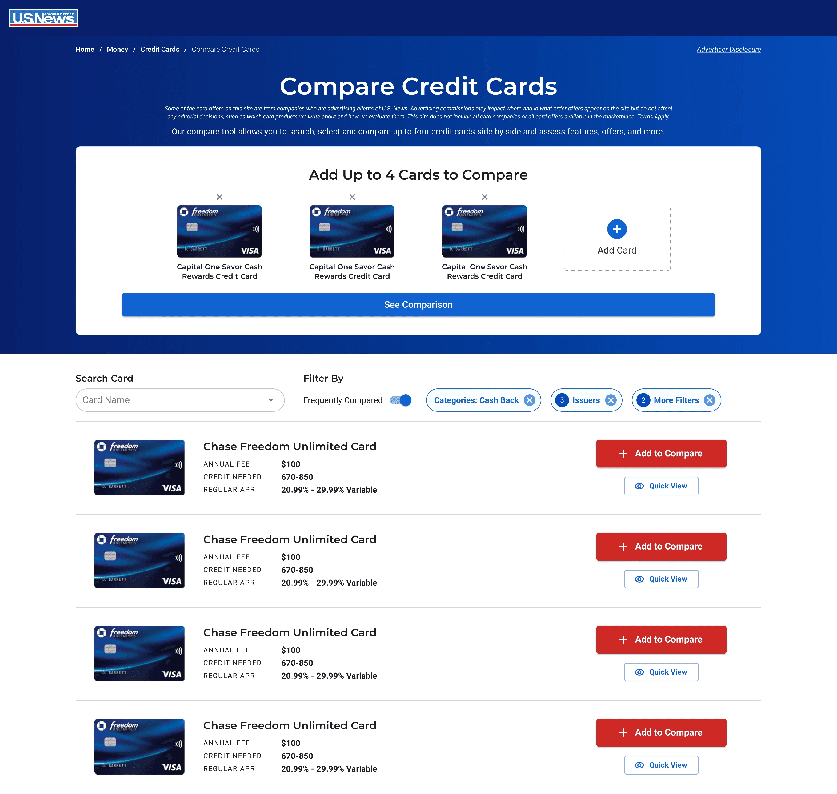
Compare Kiosk: I was inspired by competitors like NerdWallet and BankRate to create something at the top of the screen that would help orient the user and make it obvious what to do next. What I originally had in mind was that when the user pressed the "Add Card" button on the kiosk, it would open a modal for browsing/searching cards. However, this would add a lot of scope creep to the project so I presented the product manager with the option of initially launching and testing the "Add Card" button interaction as an anchor scroll to the card list, and then later we could create a browse/search modal based on the results. Another future opportunity is that the Compare Kiosk and the Sticky Compare Drawer could be merged into a single component.
Compare Kiosk: I was inspired by competitors like NerdWallet and BankRate to create something at the top of the screen that would help orient the user and make it obvious what to do next. What I originally had in mind was that when the user pressed the "Add Card" button on the kiosk, it would open a modal for browsing/searching cards. However, this would add a lot of scope creep to the project so I presented the product manager with the option of initially launching and testing the "Add Card" button interaction as an anchor scroll to the card list, and then later we could create a browse/search modal based on the results. Another future opportunity is that the Compare Kiosk and the Sticky Compare Drawer could be merged into a single component.
Compare Table: One mistake I made with the design mockups, which I addressed with the developers during handoff, was the width of the columns on mobile because ideally the third column would be more visible. This was difficult to do, since I decided to use left-sided page padding in order to create the visual effect I was going for as well as the requirements for certain cells such as star ratings. However, we were able to reduce the width of each column by 8px to allow the third column to be a little more on the screen.
Compare Table: One mistake I made with the design mockups, which I addressed with the developers during handoff, was the width of the columns on mobile because ideally the third column would be more visible. This was difficult to do, since I decided to use left-sided page padding in order to create the visual effect I was going for as well as the requirements for certain cells such as star ratings. However, we were able to reduce the width of each column by 8px to allow the third column to be a little more on the screen.
Quick View Modal: This was another new component that the PM loved and wanted for the MVP, but would needed to be built and hence did add scope creep. For this reason, I made the Quick View modal very simple.
Quick View Modal: This was another new component that the PM loved and wanted for the MVP, but would needed to be built and hence did add scope creep. For this reason, I made the Quick View modal very simple.
Filters: This was an area of this project that had many complications and ultimately I wasn't able to give the amount of thoughtfulness and effort I would have liked to for the MVP. For starters, we had a brand new design system with a very limited number of components and styles. Another designer had already designed a version of our old filter modal using the new MUI system, therefore, it was pressed upon me to use this component and to try not to make changes to it if possible so it doesn't complicate the operational side of things even more.
Filters: This was an area of this project that had many complications and ultimately I wasn't able to give the amount of thoughtfulness and effort I would have liked to for the MVP. For starters, we had a brand new design system with a very limited number of components and styles. Another designer had already designed a version of our old filter modal using the new MUI system, therefore, it was pressed upon me to use this component and to try not to make changes to it if possible so it doesn't complicate the operational side of things even more.
Detail Cards: For the browse cards page, the main goal was to make the cards as compact as possible while making it easy to read the important details. Based on user feedback, we wanted it to be possible to see multiple cards on the screen, we wanted it to be easier and faster to scroll and browse cards. The old cards were so long that one cards took up the entire screen. I wanted to make the cards and card list more visually appealing, but in the interest of time I kept the focus on this primary goal.
Detail Cards: For the browse cards page, the main goal was to make the cards as compact as possible while making it easy to read the important details. Based on user feedback, we wanted it to be possible to see multiple cards on the screen, we wanted it to be easier and faster to scroll and browse cards. The old cards were so long that one cards took up the entire screen. I wanted to make the cards and card list more visually appealing, but in the interest of time I kept the focus on this primary goal.
Desktop Mockups
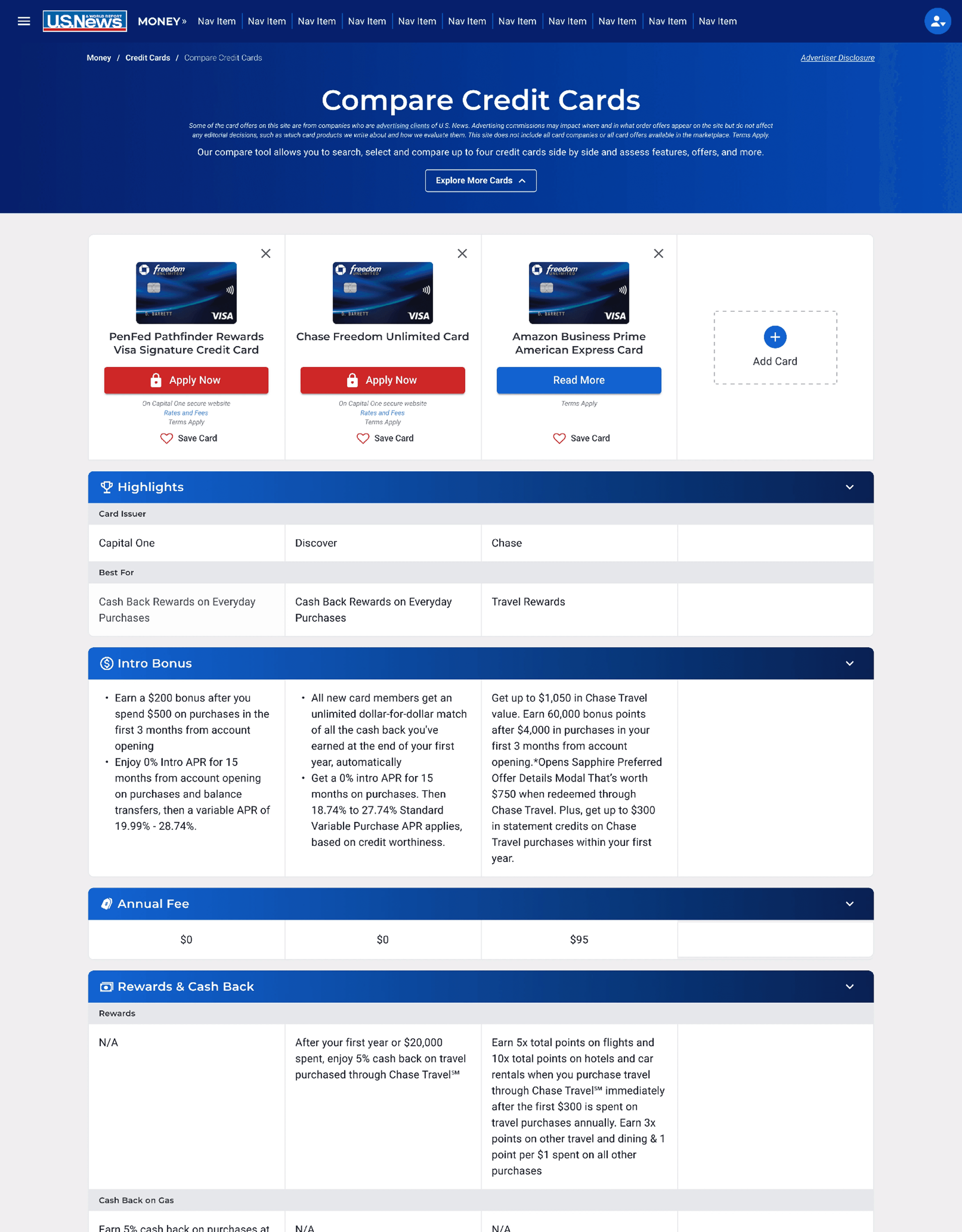
More Desktop Mockups
More Desktop Mockups


Laying Out Full Flow and Interaction States for All Breakpoints for Developer Handoff
Laying Out Full Flow and Interaction States for All Breakpoints for Developer Handoff

Collaborating with Developers to Build New MUI (React) Components
Collaborating with Developers to Build New MUI (React) Components
Collaborating with Developers to Build New MUI (React) Components
"Component cheatsheet" created in Figma.
"Component cheatsheet" created in Figma.
"Component cheatsheet" created in Figma.

Finalized components built in Storybook for testing and documenting.
Finalized components built in Storybook for testing and documenting.
Finalized components built in Storybook for testing and documenting.


Outcome
Outcome
Within the first 2 months of launching, the Credit Cards Compare Tool saw a 2.3% increase in "Apply Now" clicks.
Below is a link to the tool as well as other products the components I designed have been used on.
Unfortunately, I did not have any control over the QA'ing and deployment of these compare tools, and most of the "Add" buttons in the compare table header lack any functionality. The people in charge should have known better and made the table headers be static placeholder images instead of buttons. I worked with the engineers to make sure the compare table components were easily customizable in order to accommodate for different products and requirements.
The one product to implement the compare table component the best so far is Senior Living, in my opinion. I had previously mentored the designer on that team when I was on the Health team, and I think they did a good job of making the empty header column not look like a clickable button when it didn't have any functionality.
The good thing though is that these tools can be easily updated and customized to include pop-up modals, anchor scroll, or other creative interactions if they so choose to do so in the future.


Planned Next Steps
Planned Next Steps
Due to a tight timeline and scope of this large project creeping up, a few issues/challenges that I identified were pushed to be handled during the development and post-MVP phases.
Due to a tight timeline and scope of this large project creeping up, a few issues/challenges that I identified were pushed to be handled during the development and post-MVP phases.
Filter Improvements
Later in the design process it was brought to my attention that there would be a huge increase in the number of categories (30+) and issuers (30+) that would be added to the filters. Previously, only the top categories were listed in the filters.
On top of that, I used a newly created filter modal component made by another designer for a different project, which was built using our new MUI components and styles. Our team was attempting to prevent the design system from getting too bloated and keep consistency across different products. However, it became clear that the addition of these categories would make the filter modal on mobile super long.
I began research and ideation on making updates to the filter modal component to make it easier to use.
Mobile Compare Table Optimization
I noticed that the third column on mobile was cut off a little too much. Ideally, the third column would be more visible to the user. This design optimization was planned to be made post-launch.
Mobile Compare Table Optimization
I noticed that the third column on mobile was cut off a little too much. Ideally, the third column would be more visible to the user. This design optimization was planned to be made post-launch.
Quick View Modal Improvements
Improve visual design and data display of this component.
Quick View Modal Improvements
Improve visual design and data display of this component.

Future Design Ideas Nobody Asked For
Future Design Ideas Nobody Asked For
Throughout this process I discovered and documented ideas for future iterations that the product team liked, but felt would be better for post-MVP.
Throughout this process I discovered and documented ideas for future iterations that the product team liked, but felt would be better for post-MVP.
The Compare Card Kiosk shrinks and sticks to the top of the screen after scrolling past it. This would replace the existing component at the bottom of the screen that shows the cards you've added.
The Compare Card Kiosk shrinks and sticks to the top of the screen after scrolling past it. This would replace the existing component at the bottom of the screen that shows the cards you've added.
Browse/Search Modal for when user clicks on the "Add Card" button in the Compare Table Header and/or Compare Card Kiosk.
Browse/Search Modal for when user clicks on the "Add Card" button in the Compare Table Header and/or Compare Card Kiosk.
Credit Card Detail Cards redesigned to be more visually appealing and modern.
Credit Card Detail Cards redesigned to be more visually appealing and modern.
A "Pin Card/Column" feature on mobile which would move and pin any column to the far left side of the compare table. (Not Shown)
A "Pin Card/Column" feature on mobile which would move and pin any column to the far left side of the compare table. (Not Shown)


